
Mobile Layout Problems That Quietly Kill Leads
Your site might look great on your laptop and be a mess on the phones most of your visitors are holding. Here are the mobile problems I see most often, how to spot them in a few minutes, the usual fixes, and a simple checklist you can run yourself.
Here's a scenario I run into all the time. A business owner tells me the website "looks fine." And on their desktop computer, it does. Clean layout, nice photos, everything lined up.
Then I pull it up on a phone. The heading is cut off on the right. The menu button doesn't do anything. The "Call now" button is so close to another link that I tap the wrong one twice. The contact form looks okay, but when I hit "Send," nothing happens.
None of these problems throw an error. Nobody emails you to say "your button is too small." People just leave and contact someone else. That's why I call them quiet lead killers.
Let's go through the most common ones, how to spot each, and what usually fixes it.
Why mobile problems are so easy to miss
A few reasons these issues slip through:
- You probably edit your site on a computer. So that's the version you see most.
- Shrinking your browser window isn't the same as a phone. It helps, but real phones handle touch, fonts, zoom, and browser bars differently.
- Page builders store separate mobile settings. A change made on desktop doesn't always carry over properly to tablet and phone, and vice versa.
- Content changes over time. A longer heading, a new image, or an extra button can break a mobile layout that used to be fine.
- Visitors don't complain. They just leave.
Google also primarily looks at the mobile version of your pages when it indexes your site. So mobile isn't a nice-to-have, it's the version that counts.
How to check your site on mobile properly
Before we get into specific problems, here's how to look:
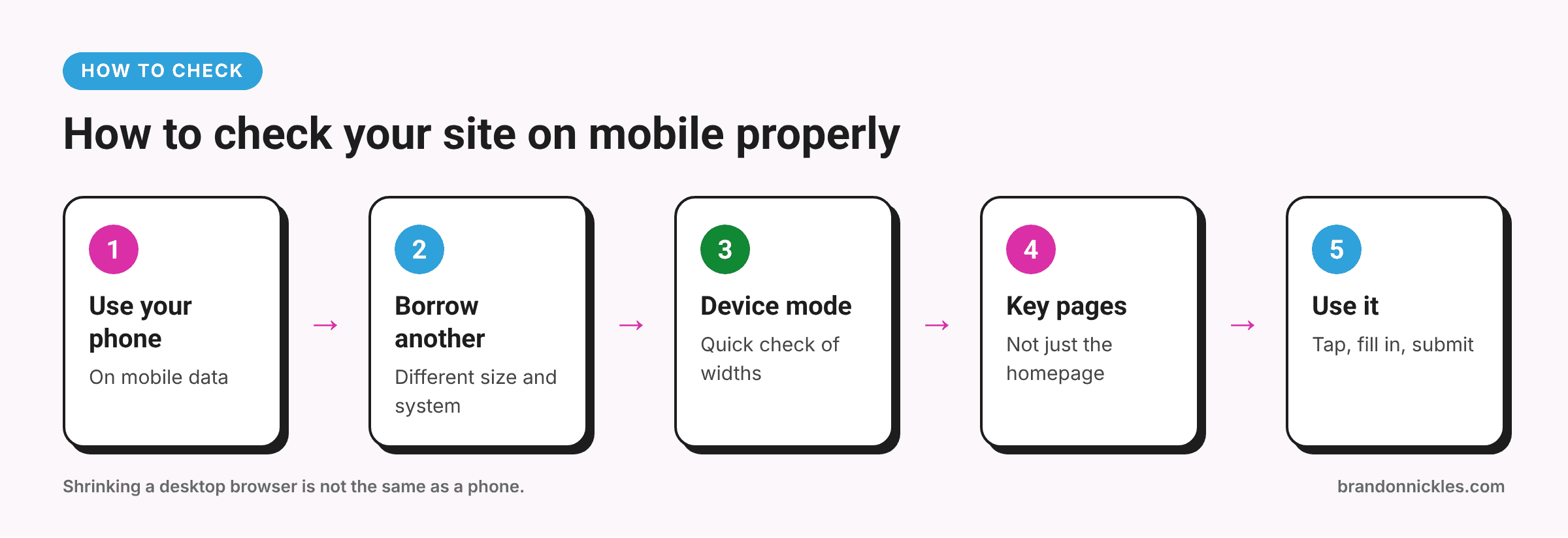
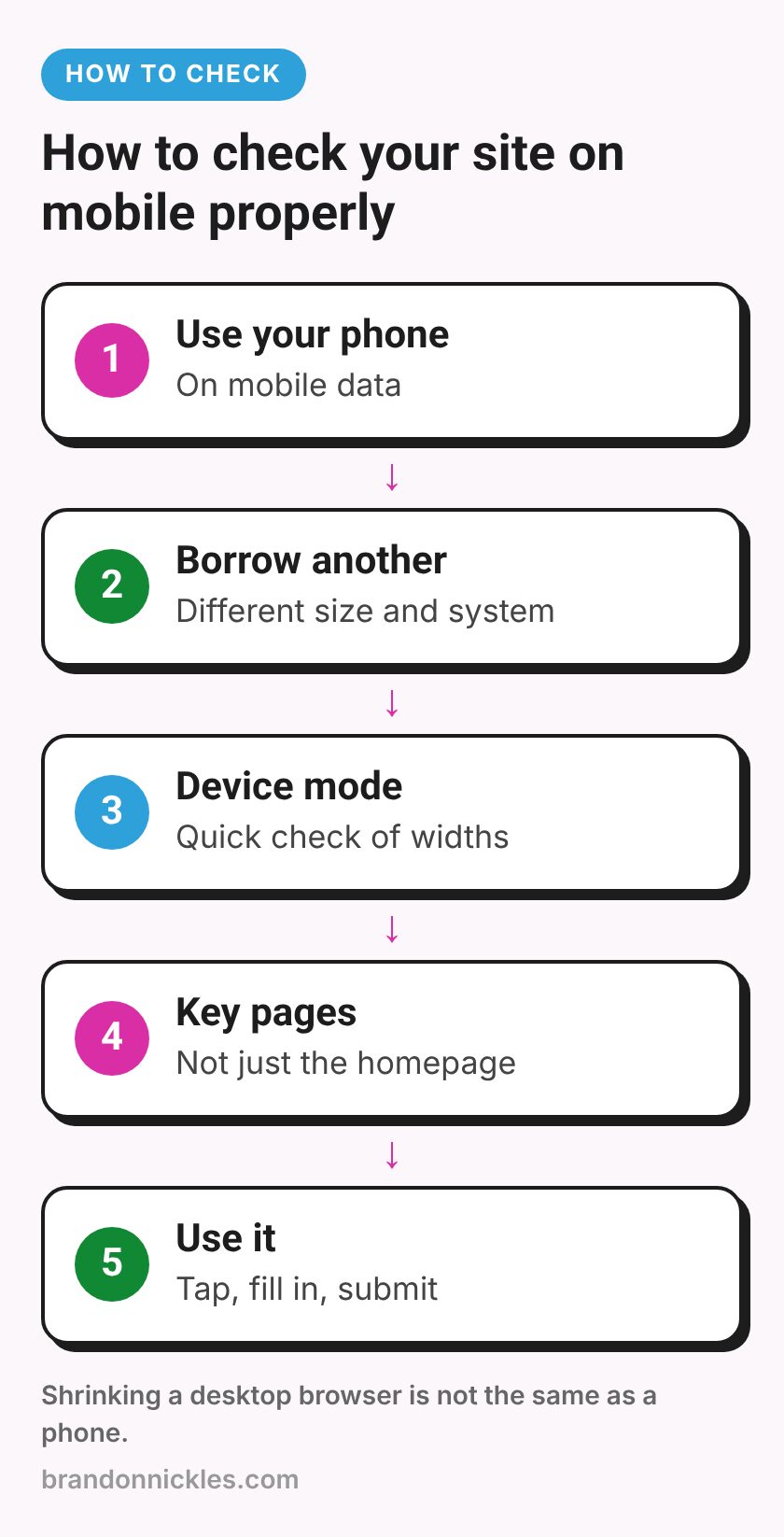
- Use your actual phone. Open your key pages on mobile data, not just office Wi-Fi.
- Borrow another phone. An iPhone and an Android phone, or a smaller and a larger screen, often show different problems.
- Use your browser's device mode. In Chrome, right-click → Inspect, then click the phone/tablet icon. It's handy for checking several screen widths quickly.
- Test your important pages, not just the homepage. Service pages, contact page, landing pages from ads, and your most popular blog posts.
- Actually use the page. Tap the menu, tap every button, fill out the form, and submit it.
Now let's look at what to watch for.
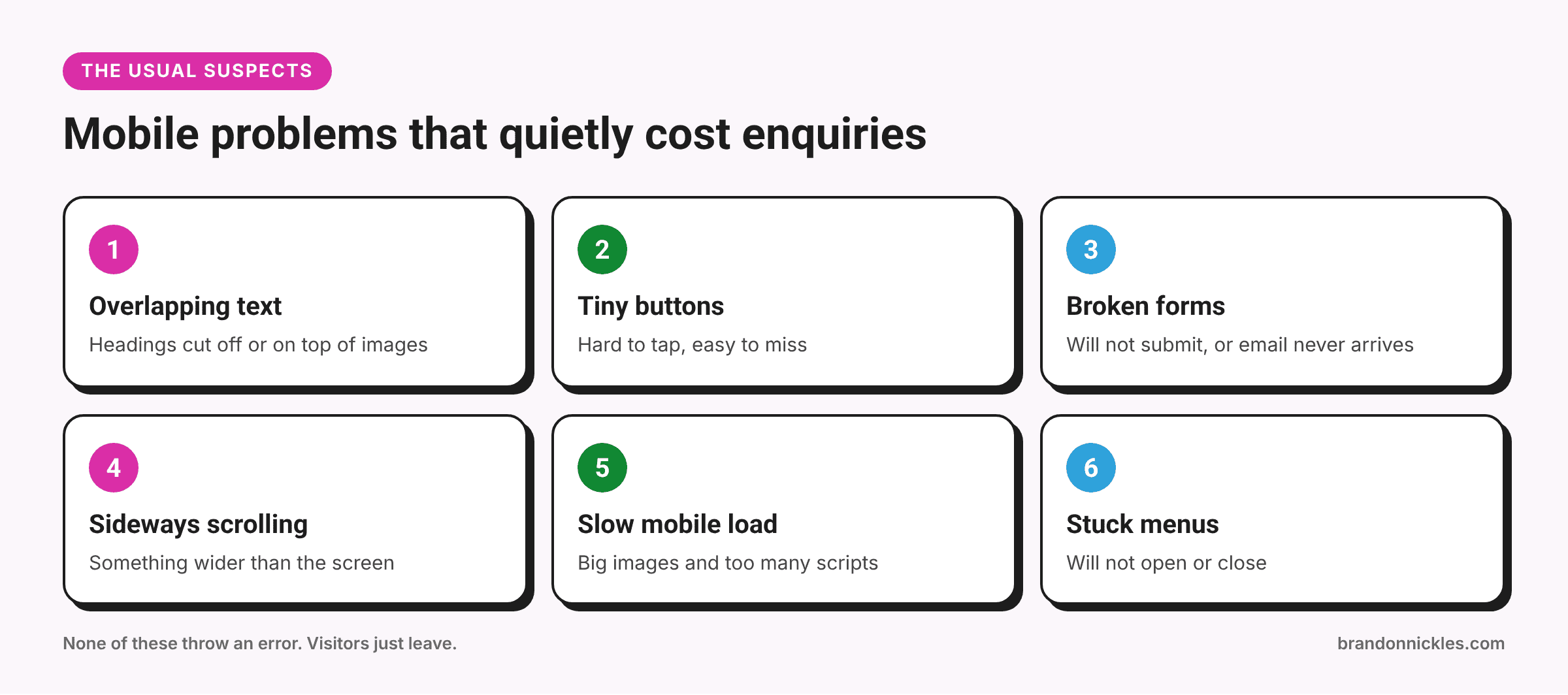
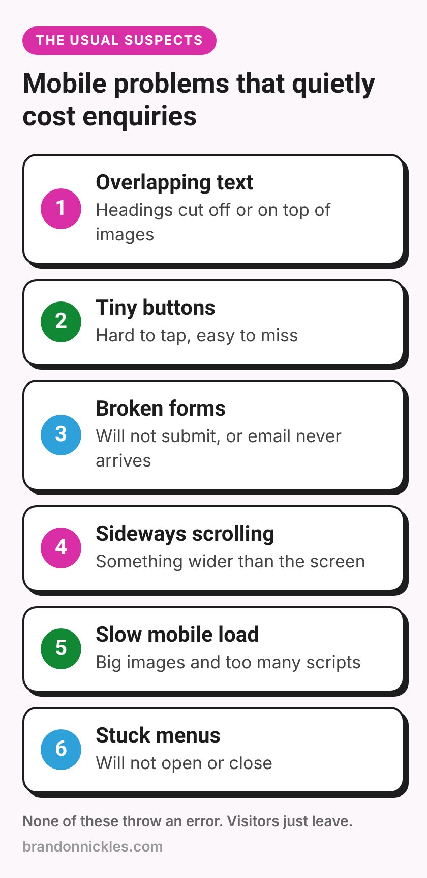
1. Overlapping or cut-off text
What it looks like: Headings running off the right edge, text sitting on top of images, words broken mid-word, or text hidden behind another element.
Why it happens:
- Font sizes set for desktop and never adjusted for mobile
- Fixed widths or heights on boxes, so content can't grow or wrap
- Elements positioned "absolutely" (pinned in place) to look right on desktop
- Long words or URLs that can't wrap
- Negative margins used to create overlapping designs on desktop
Usual fixes:
- Set smaller heading sizes for mobile, or use sizes that scale with the screen
- Remove fixed heights so boxes can grow with their content
- Replace pinned positioning with normal layout on smaller screens
- Allow long words and URLs to wrap
- Check the mobile settings in your page builder for the affected section
2. Buttons and links that are too small or too close together
What it looks like: You have to zoom in to tap a button, or you keep tapping the wrong link. Phone numbers and email addresses that aren't tappable at all.
Why it happens: Buttons sized for a mouse pointer, menu links packed tightly together, footer links in tiny text, and phone numbers added as plain text instead of links.
Usual fixes:
- Make buttons and tap targets comfortably large, with space around them. Google's accessibility guidance in Lighthouse flags tap targets that are too small or too close together.
- Turn phone numbers into tap-to-call links (
tel:) and emails intomailto:links - Add spacing between menu and footer links on mobile
- Make your main call to action easy to reach without hunting for it
3. Forms that don't submit (or seem to, but don't)
This is the one that worries me most, because it directly costs you enquiries.
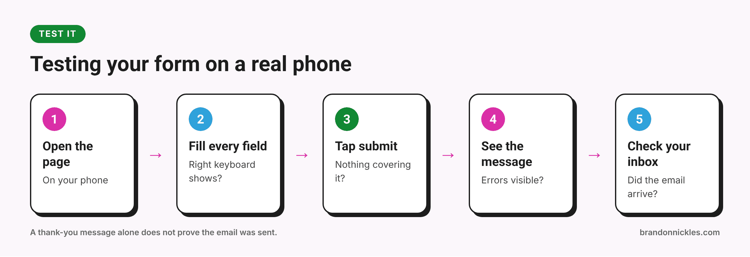
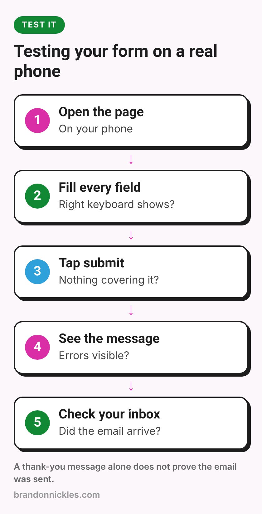
What it looks like:
- The submit button doesn't respond, or is hidden behind something
- An error appears but you can't see it because it's off-screen
- A spam-protection check (like a captcha) doesn't load or doesn't fit the screen
- The form says "thank you" but the email never arrives
- Fields are so small that typing is a struggle, or the keyboard covers the field
Why it happens: A sticky header, chat bubble, or cookie banner covering the submit button; a captcha that's too wide for small screens; JavaScript conflicts between plugins that only show up in mobile browsers; caching or optimization settings that break the form script; or email delivery problems that have nothing to do with mobile but you only notice when testing.
Usual fixes:
- Submit your own form on a real phone and confirm the email arrives
- Make sure nothing covers the submit button on small screens
- Use the right field types (
email,tel) so phones show the right keyboard - Check that spam protection works and fits on mobile
- Exclude form pages or scripts from aggressive optimization if they cause trouble
- Set up reliable email sending for your site, so notifications don't land in spam
If you track leads, check that form submissions on mobile are still being counted too. My lead tracking checklist walks through testing that.
4. Images and elements pushing content off-screen
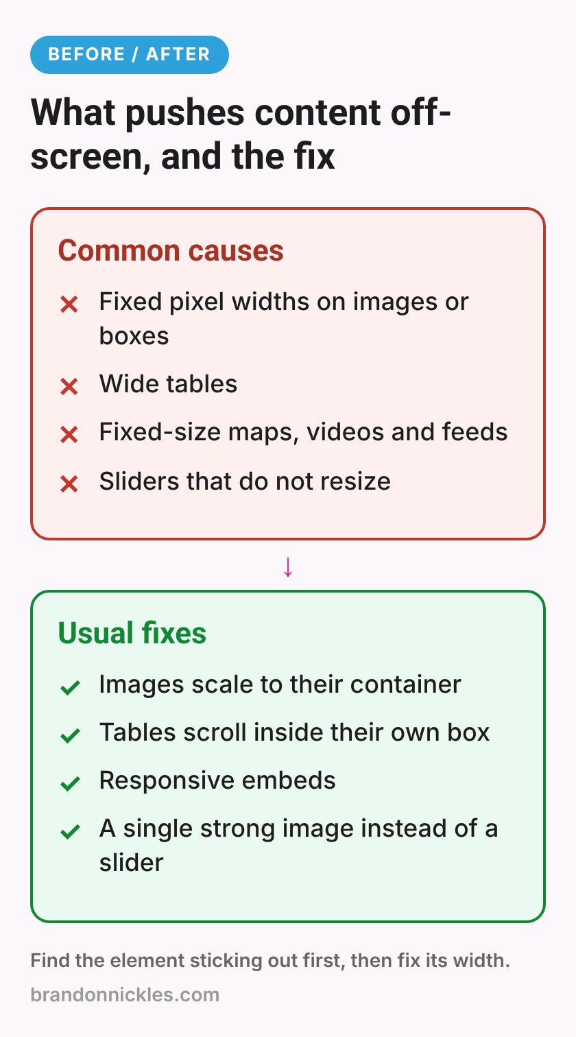
What it looks like: The page scrolls sideways. There's a strip of blank space on the right. An image, table, or embedded video is wider than the screen.
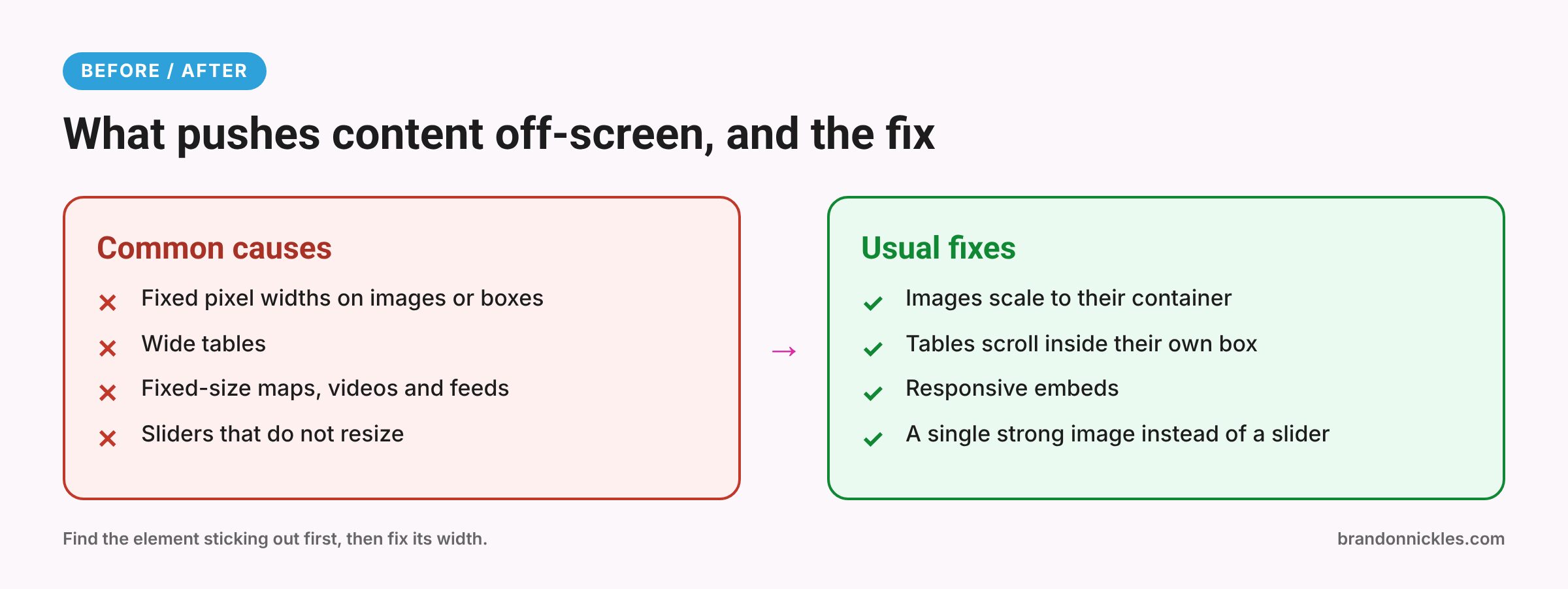
Why it happens:
- Images or containers with a fixed width set in pixels
- Tables with lots of columns
- Embedded maps, videos, or social feeds with fixed sizes
- A single element with a margin or width that's wider than the phone
- Sliders and carousels that don't resize properly
Usual fixes:
- Make images scale to the width of their container
- Wrap wide tables so they scroll inside their own box, or restructure them for mobile
- Use responsive embeds for videos and maps
- Find the element causing sideways scrolling (in Chrome device mode, scroll right and look for what's sticking out) and fix its width or margin
- Rethink sliders on mobile. Often a single strong image works better
5. Slow mobile load
What it looks like: A blank or half-loaded screen for a while on mobile data, the layout jumping around as things load, or buttons that don't respond at first.
Why it happens: Large images that weren't resized for phones, heavy sliders or video backgrounds, lots of scripts (chat, popups, tracking, social feeds), too many fonts, and weak hosting or no caching.
Usual fixes:
- Resize and compress images, and use modern formats like WebP where possible
- Lazy-load images further down the page, but not the main image at the top
- Remove or delay scripts you don't need on every page
- Cut down font families and weights
- Turn on caching and check your hosting
Run your key pages through PageSpeed Insights and look at the mobile results. My post on why WordPress sites get slow explains the fixes in more detail.
Is your site losing leads on mobile?
If you've just pulled up your site on your phone and winced, I can help. Fixing mobile display problems is something I do every day: overlapping text, broken menus, forms that won't send, and layouts that fall apart on small screens. I'll fix the layout so it looks sharp on every screen.
Okay, back to the list. A few more that come up a lot.
6. Menus that don't open or won't close
What it looks like: Tapping the menu icon does nothing, the menu opens but can't be closed, it opens behind other content, or submenu items can't be reached.
Why it happens: JavaScript conflicts, caching or script-delay settings that hold back the menu's code, layering problems with sticky headers, and dropdowns designed for hover (which phones don't have).
Usual fixes: Check for script errors, exclude the menu script from delay settings if needed, fix the layering, and make sure submenus can be opened with a tap.
7. Popups, banners, and chat bubbles that cover everything
What it looks like: A popup fills the whole screen and the close button is off-screen. A cookie banner and a chat bubble together cover half the page. A sticky header takes up a big chunk of a small screen.
Why it happens: Popups designed for desktop, too many "sticky" elements competing for space, and no mobile-specific settings.
Usual fixes: Make close buttons easy to see and tap, delay or limit popups on mobile, shrink sticky headers on small screens, and make sure chat bubbles don't sit on top of buttons or forms. Google has also said that intrusive interstitials can hurt the mobile experience, so this is worth getting right.
8. Text that's hard to read
What it looks like: Tiny body text, light grey text on a white background, long lines of text in narrow columns, or text over busy background images.
Usual fixes: Increase body text size on mobile, improve contrast, add a dark overlay behind text on images, and give paragraphs comfortable line spacing.
Your mobile self-audit checklist
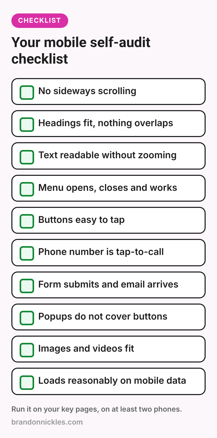
Grab your phone and go through this on your homepage, your main service pages, your contact page, and any page you send ad traffic to:
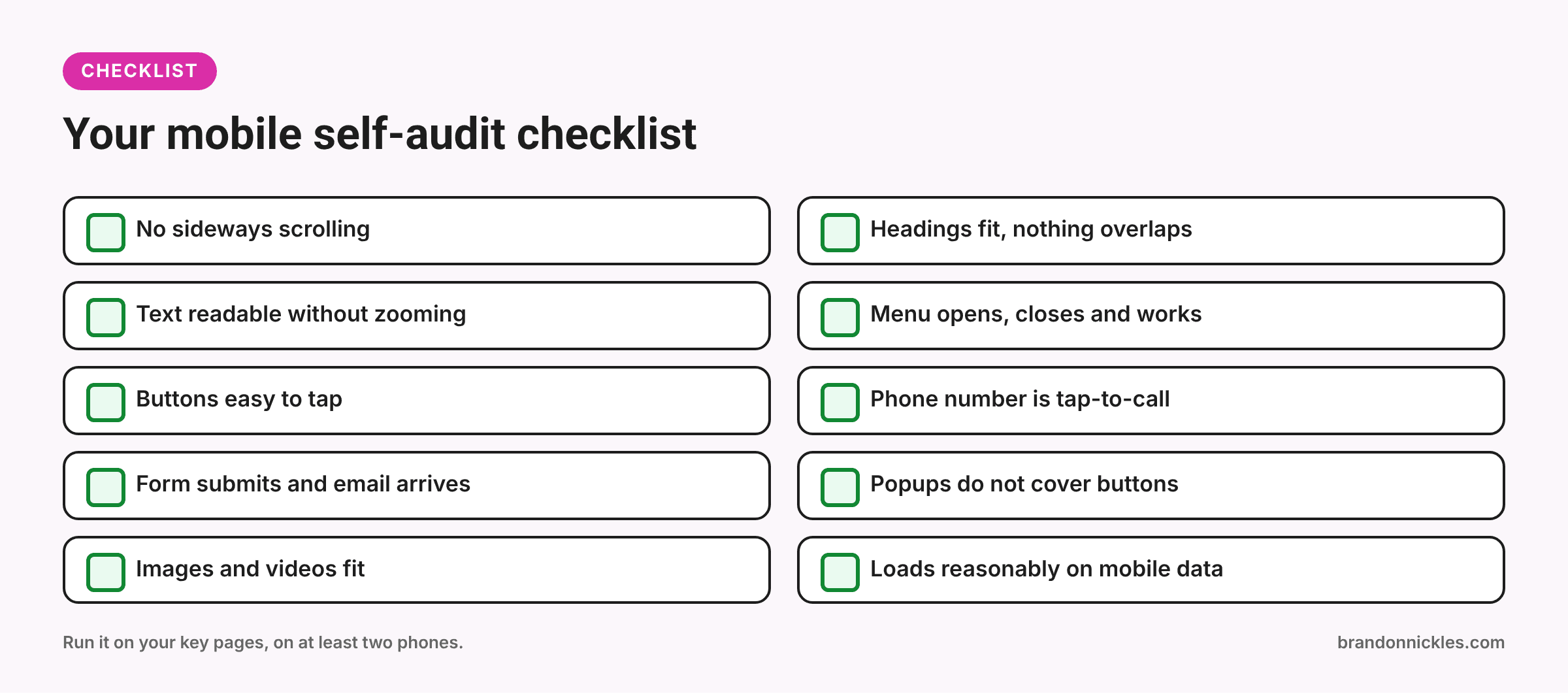
- No sideways scrolling or blank strip on the right
- Headings fit on screen and nothing overlaps
- Body text is comfortable to read without zooming
- Menu opens, closes, and every link works
- Buttons are easy to tap and not crowded together
- Phone number is tap-to-call; email is tappable
- Contact form fits, submits, and the email actually arrives
- Popups, cookie banners, and chat bubbles don't cover buttons or forms
- Images and videos fit the screen
- Page loads in a reasonable time on mobile data
- Nothing jumps around while the page loads
- Checked on at least two different phones
Anything you can't tick off is a good place to start.
Fixing it without breaking desktop
A few tips if you or your developer are working through these:
Fix on staging first if the changes are more than a quick setting. My post on staging sites explains how.
- Fix the system, not just the page. If every page has oversized headings on mobile, fix the global heading styles rather than each page individually.
- Check every breakpoint. In builders, check the desktop, tablet, and mobile views after each change.
- Test after updates. Theme and builder updates can change mobile layouts. Add a quick phone check to your update routine.
- Don't hide important content on mobile. It's tempting to just hide a section that looks bad. Fix it instead, especially if it contains key information.
If your site was built with a page builder, my post on page builders vs. custom themes covers why mobile settings tend to drift over time.
Frequently asked questions
My site is "responsive." Doesn't that mean it works on mobile?
Responsive means the layout adapts to the screen size. It doesn't guarantee every page looks right. Content added after launch, page builder settings, and plugins can all break a responsive layout in specific places.
How do I know if mobile issues are costing me leads?
You can check mobile versus desktop visits in your analytics and test your own forms on a phone. The clearest signs are forms that don't work on mobile or pages where people leave quickly. Without proper tracking, though, it's hard to know for sure, which is a good reason to set it up.
Should I have a separate mobile site?
Generally no. A single responsive site that works well on all screen sizes is the standard approach and much easier to maintain.
Can mobile problems hurt my Google rankings?
Google primarily uses the mobile version of your pages for indexing, and page experience is one of the things it considers. Good content matters more, but a frustrating mobile experience doesn't help.
How long does it take to fix mobile layout problems?
It depends on how many problems there are and how the site is built. Some are a quick settings change; others need a section rebuilt. I'll tell you which is which before starting.
Ready for a site that works on every screen?
Most of your visitors may be on a phone, and they won't tell you when something's broken. If you'd like a second pair of eyes, or you already know what's wrong and want it fixed, send me the pages that matter most. I back up your site before I touch it and reply the same day.
Email me at Brandon@brandonnickles.com.
And if you'd like someone keeping an eye on your site after updates, take a look at my managed WordPress hosting.